

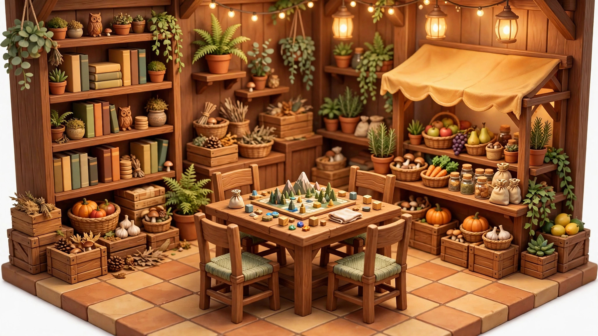
Terrain tells players where they are; props tell them what the place is. Gimkit creative props are the decorative objects — trees, tables, crates, plants, signs, themed set pieces — that turn a tiled floor plan into a fishing village, a spaceship or a haunted library. The gimkit creative props library is big, and knowing how to choose and place props well is the difference between a map that looks cluttered and one that looks crafted.
This guide covers prop selection, placement technique, layering with terrain, and the memory discipline that lets you decorate generously without wrecking your map’s budget. It follows naturally from our terrain and layers guide — read that first if your base map still looks flat. And if the editor itself is still new to you, start with our Gimkit Creative beginner’s guide before decorating anything.
best props gimkit creative
There is no universal list of the best props gimkit creative has, because the best prop is the one that matches your area’s idea. But experienced builders do reach for the same categories again and again:
- Nature props — trees, bushes, rocks, flowers. The fastest way to make outdoor terrain feel alive; a path edged with trees reads as a forest road instantly.
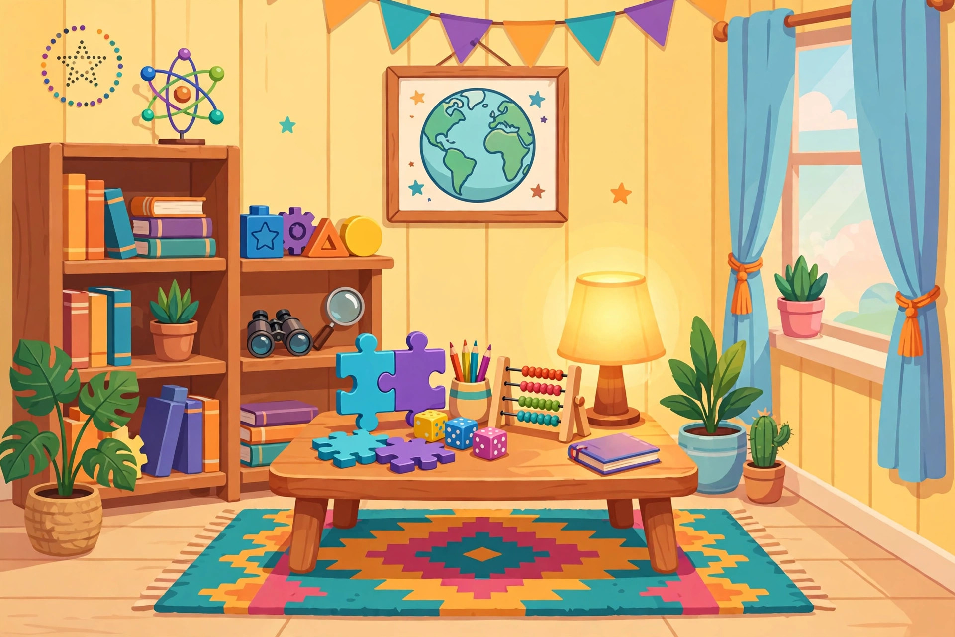
- Furniture and interiors — tables, chairs, shelves, counters. These turn an empty room into a tavern, classroom or shop with three placements.
- Crates, barrels and clutter — the universal filler. Corners feel real when something sits in them; battle arenas feel designed when cover objects break up sightlines.
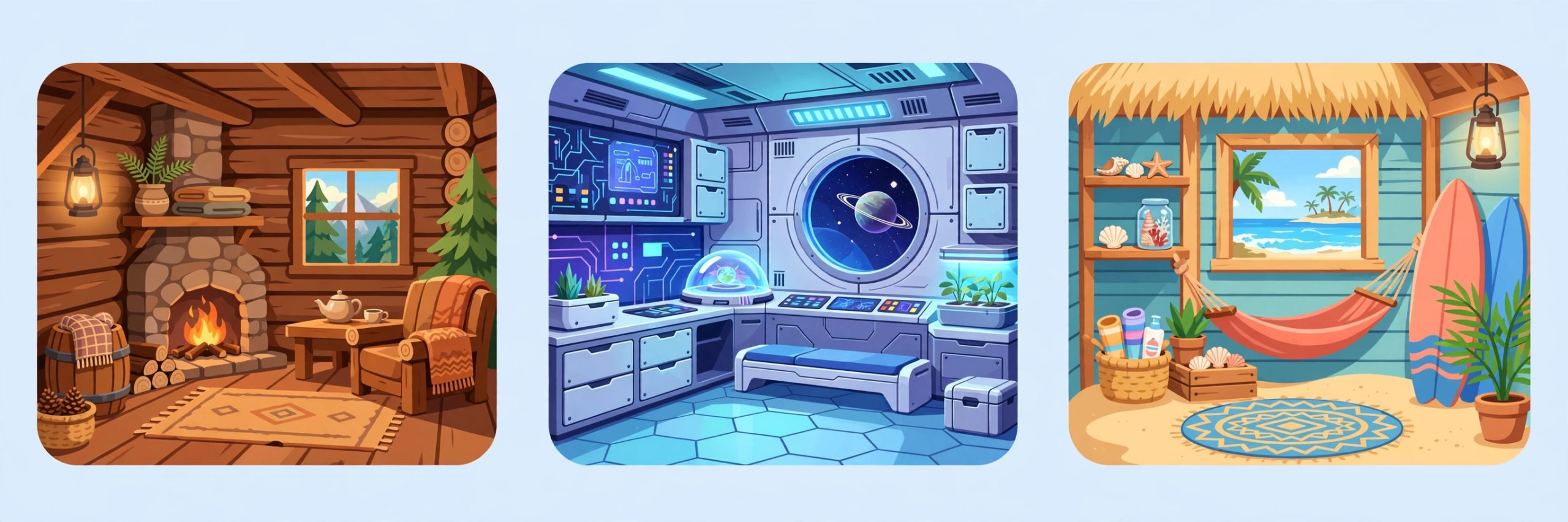
- Themed set pieces — the seasonal and mode-flavored props (space, medieval, farm, winter). One themed hero prop anchors an area’s identity better than twenty generic ones.
- Signage-style props — objects that imply information: a dock’s posts, a market stall, a trophy on a pedestal. Players read scenes like sentences; props are the nouns.
The selection rule that never fails: decorate in service of one idea per area. If the area is a pirate cove, every prop should be defensible as pirate-cove. The moment a space piano lands in the pirate cove “because it looked cool,” the spell breaks.
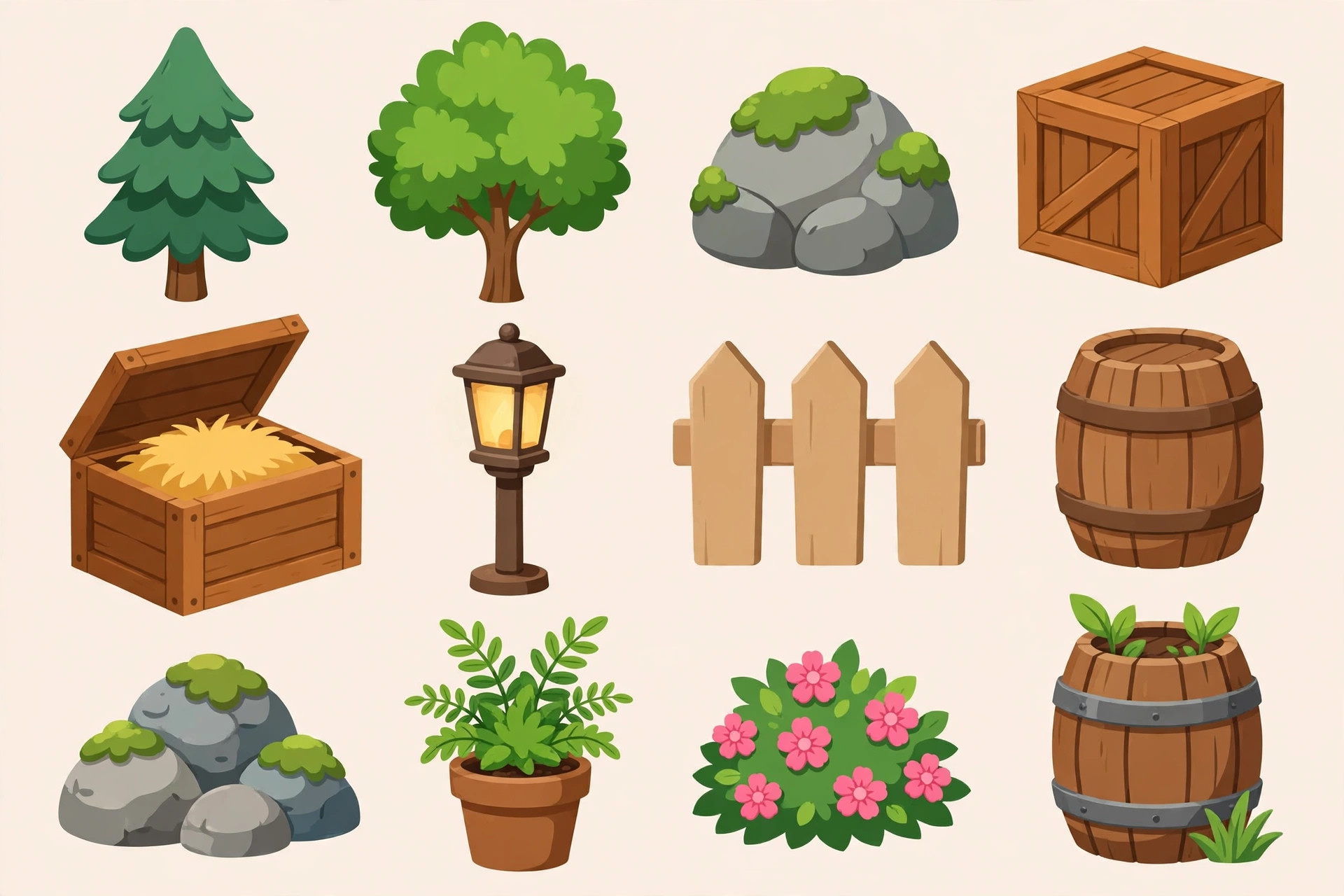
decorate gimkit map
Knowing how to decorate gimkit map areas is a placement craft more than a shopping one. Techniques that consistently work:
Work in passes. Pass one: hero props (the big identity pieces). Pass two: clusters — groups of two or three small props that form little scenes (a table with chairs, a crate beside a barrel). Pass three: sprinkles — single small props that break up remaining emptiness. Zoom out between passes; decoration is judged at player zoom, not editor zoom.
Cluster, don’t scatter. Real places group objects: chairs around tables, trees in groves, crates in stacks. Randomly even spacing is the number one cause of “looks fake.” Deliberate clusters with deliberate gaps between them look designed every time.
Layer props over terrain intentionally. Props sit above your terrain layers, and many can be adjusted — moved precisely, and where the prop supports it, rotated or resized for variety. Two identical trees at slightly different sizes read as a forest; twelve identical trees in a grid read as a spreadsheet.
Mind the walkways. Players need to move. Decorate edges, corners and around objectives; keep main paths prop-free or prop-edged. A beautiful room nobody can cross is a bug with good art direction. Playtest your decorated map on foot, not just from the editor’s god view.
Use props to teach the map. A line of torches toward the exit, identical statues flanking the correct door, the only red object in a grey room sitting on the goal — decoration as guidance. Players follow visual emphasis instinctively; spend it on purpose.
Then connect it all: props set the scene that devices animate. Our Creative ideas collection shows decorated builds — escape rooms, race tracks, boss arenas — where props and devices share the credit. The Gimkit Help Center documents prop controls precisely if a specific adjustment eludes you.
Props and Memory: Decorate Smart
Every prop costs memory — individually small (on the order of a handful of units, roughly 10 for a typical prop), but maps are decorated by the hundred, and the costs add up to real percentages of the 100,000 budget. Practical discipline:
- Decorate the areas players linger in (hubs, puzzle rooms, arenas) richly, and travel corridors lightly.
- Prefer a few larger hero props over carpets of tiny ones — similar visual payoff, lower count.
- Never decorate outside the playable space “just in case.” Out-of-sight props still cost memory.
- Check the memory bar after each decorating pass, not at the end when the bill comes due all at once.
Decoration Styles: Three Looks That Always Work
If choosing a style from scratch feels overwhelming, steal one of these three proven directions:
The storybook look. Saturated, friendly, a little exaggerated: big trees, round bushes, colorful set pieces, everything slightly larger than life. This is the native accent of Gimkit’s own 2D modes, and it suits younger classes and adventure maps. The discipline it needs is restraint — storybook curdles into chaos fast when every prop shouts.
The diorama look. Treat each room as a museum model: realistic clusters, muted variety, negative space respected. Furniture grouped as it would be in life; nature arranged as it grows. Diorama maps photograph beautifully and read clearly, which is why showcase builders love them. Their weakness is sameness — vary one element per room (lighting-feel via terrain, one hero color) to keep rooms distinct.
The minimal look. Very few props, each placed like punctuation: the single tree on the hill, the lone throne, the one red crate. Minimal maps are cheap on memory, fast to build and strangely elegant — and they make every placed object feel meant. The risk is emptiness; minimal works when the terrain underneath is strong.
Pick one per map, not per room. Style is a promise you keep for the whole build.
Field Notes From Finished Maps
The two-prop rule. If a corner needs decoration, it usually needs exactly a relationship: two props that imply a story (bench + lamp, crate + barrel, sign + fence). Single scattered props look lost; pairs look intentional. Work in pairs and your per-prop impact doubles at the same memory cost.
Decorate the screenshot spots. Players remember — and teachers screenshot — the spawn area, the boss arena and the finish. Give those three places double decoration budget and let ordinary corridors stay plain. Effort follows attention, always.
Leave one thing unfinished on purpose. A half-built scaffold, a “under construction” corner of crates: tiny imperfections make a world feel inhabited rather than rendered. Perfection is sterile; a single human mess is charm.
Rotate your own stock. Decorating map after map with your personal favorite props makes all your maps look alike. Force one new category per build — this map gets the farm props, next map the space set — and your style library grows instead of narrowing.
Prop Placement Clinic: Fixing One Real Room
Theory is tidy; rooms are not. Watch the clinic fix a typical broken room — a library that “feels wrong” despite fifty props. The diagnosis runs in the order a clinician checks, and the order matters.
First, traffic: bookshelves have crept into the walk line, so every crossing is a slalom. Shelves move to the walls, and the room breathes. Second, purpose: the center holds a random campfire (“it looked cool”); it is replaced by a reading table cluster, the thing a library’s center is actually for.
Third, sight lines: the questioner hides behind a tall stack; swapping the stack for a low prop means the room’s reason for existing is visible from the door. Fourth, rhythm: the decoration sits in a uniform sprinkle, so it is regrouped into three clusters — window nook, stacks, reading center — giving the eye a route to travel.
Total props placed: the same fifty, minus six. The room did not need more stuff; it needed its stuff to be argued for. Run any flat room through the same four checks — traffic, purpose, sight lines, rhythm — and decorate by diagnosis rather than by instinct. It is less romantic than inspiration and dramatically more reliable.
Keep the clinic habit in a notebook, literally: two columns, symptom and fix, filled in after each build. Within a few maps the notebook becomes a personal style guide written in your own mistakes — the most useful design document you will ever own, because every line in it was learned at the exact moment you needed it.
Decorate one room a day if that is all the schedule allows — a week of single-room passes produces a fully finished map, while a month of intending to “do the whole thing Saturday” produces a permanently plain one. Small, finished, and argued-for beats large, someday, and sprinkled, every single time.
Frequently Asked Questions
Can props block player movement?
Many props are decorative and can be walked around or positioned to shape movement; use terrain and barriers when you need guaranteed blocking, and props to suggest boundaries.
Can I rotate or resize props?
Many props support adjustment in the editor — select the placed prop and use its options. Not every prop offers every adjustment, so experiment on a test tile first.
How many props should a room have?
Enough to express one clear idea and fill corners — typically a hero piece plus a few clusters. If you cannot say what a prop adds, remove it and see if the room misses it.
Do props affect gameplay or just looks?
Looks, plus light spatial shaping. The interactive work belongs to devices; props are the storytelling layer on top.
Final Thoughts
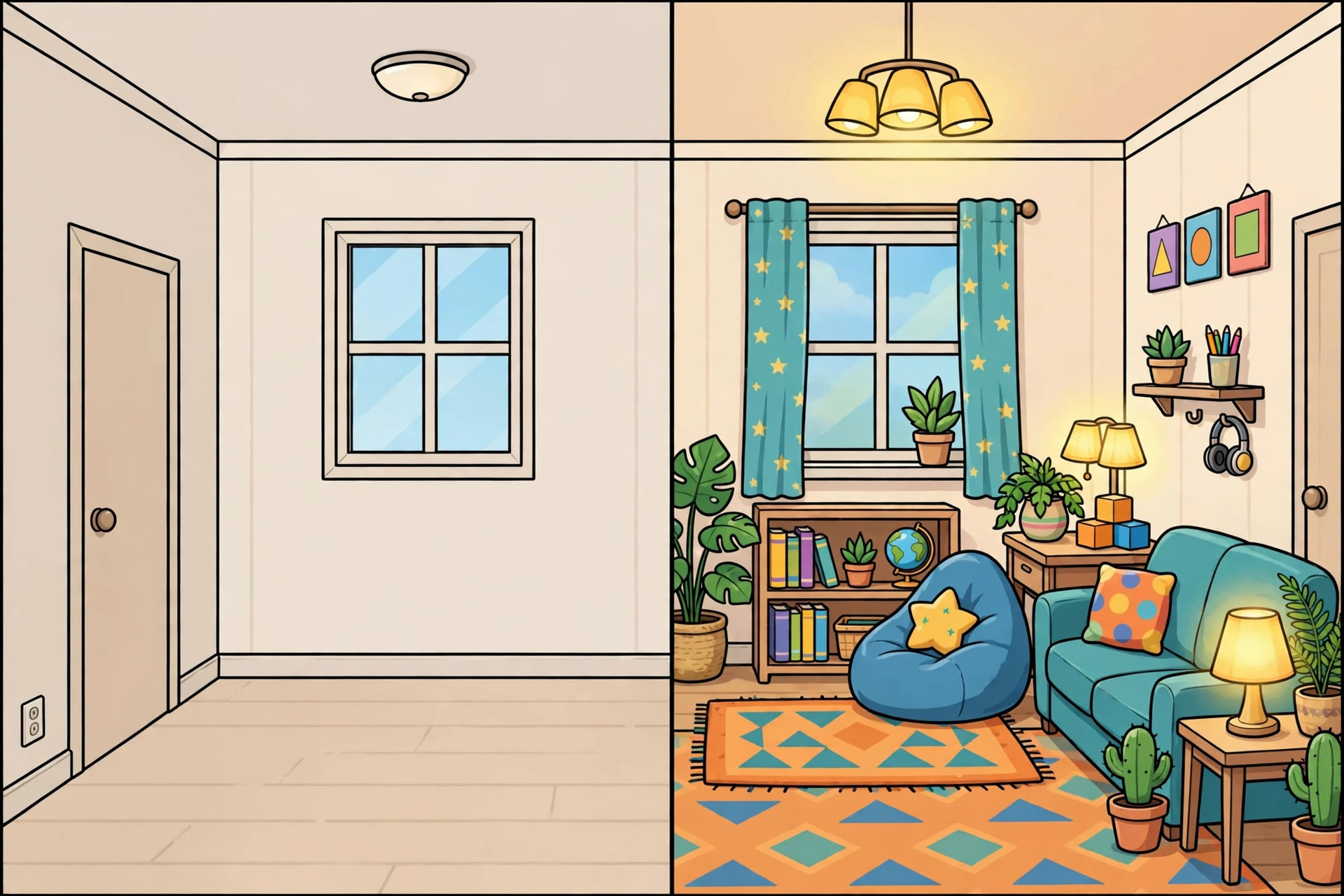
Props are storytelling: pick pieces that agree with each other, place them in clusters and passes, keep paths walkable, and watch the memory meter as you go. Decorate with intent, and your map stops looking like a grid with stuff on it — it starts looking like a place.
